
Australia’s housing market provokes strong opinions: optimists argue that prices will keep marching higher, while pessimists warn of looming crashes. The truth is more nuanced. Dr Shane Oliver, chief economist at AMP, recently shared seven charts that help explain what’s really happening underneath the headlines. We’ve summarised his insights and added our perspective.
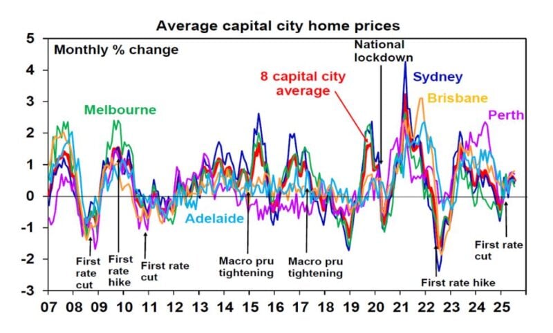
1. The property cycle is turning up again
After a brief pause earlier this year, national home values have resumed their climb. CoreLogic data shows a rise of around 0.5 % this month alone, and importantly the recovery isn’t confined to the usual high‑flyers. Cities such as Melbourne, Hobart, Canberra and Darwin are now joining Brisbane, Adelaide and Perth in positive territory. A broad‑based upswing suggests the market cycle is turning higher rather than delivering a one‑off blip.
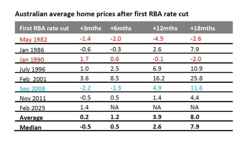
2. Falling interest rates remain a key driver
Lower interest rates make borrowing cheaper and boost buyers’ ability to bid for property. Dr Oliver notes that in five of the past seven rate‑cutting cycles since 1982, home prices climbed significantly over the following 12–18 months, provided the economy stayed out of recession. The AMP base case now includes four quarter‑point cuts starting in August and extending into next year, which has already lifted buyer confidence.
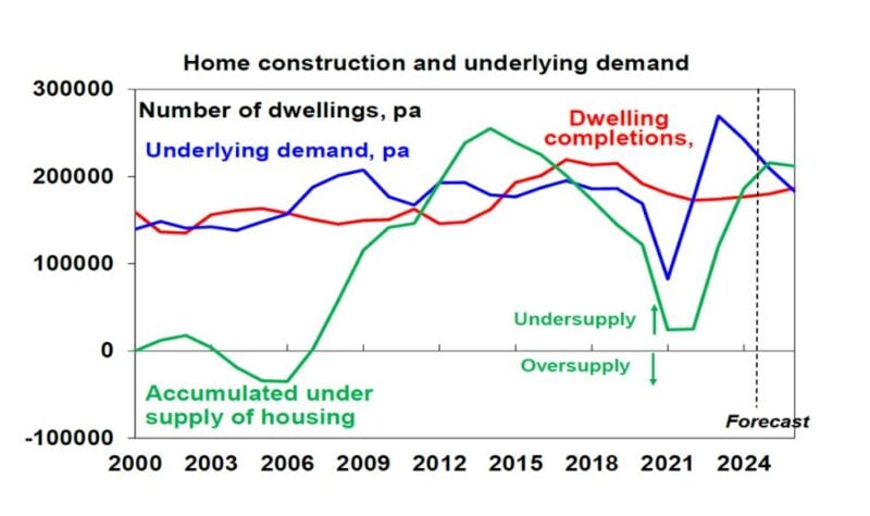
3. Chronic undersupply is the elephant in the room
Strong population growth driven by migration has not been matched by housing completions, leaving Australia short of at least 200 000 dwellings and perhaps as many as 300 000. This imbalance between supply and demand has been a major structural force behind long‑term price growth.
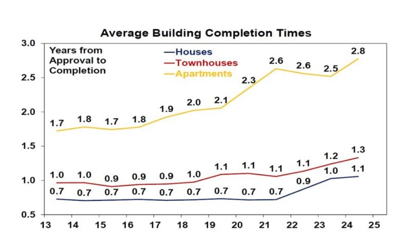
4. Home building times are blowing out
Even if more homes are approved, they aren’t being delivered quickly. Over the past decade the time taken to complete a house has increased by about 57 % and unit construction times have risen by roughly 65 %. Red tape, higher construction costs and a shortage of skilled labour are to blame. Reforms to planning and building practices are needed to boost output.
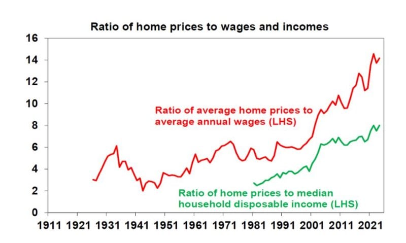
5. Property is expensive – but that’s only part of the story
The typical Australian now needs almost a decade to save a 20 % deposit, compared with around four years in the 1980s. House prices relative to wages and household incomes have surged, and the price‑to‑rent ratio sits roughly 30 % above its long‑run average. These metrics point to stretched valuations, but they don’t necessarily signal an imminent crash. High prices and debt levels do, however, limit the potential upside and make the market more vulnerable if unemployment rises.
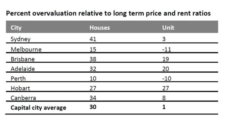
6. It’s not one market – it’s many
When people talk about “the Australian property market,” they often gloss over the fact that markets behave differently by location and property type. Dr Oliver’s valuation table suggests that detached houses are around 30 % overvalued relative to rents, whereas apartments are only about 1 % overvalued. Perth and Melbourne currently appear to be the least overvalued capital cities for houses, while both markets show better value in the unit sector.
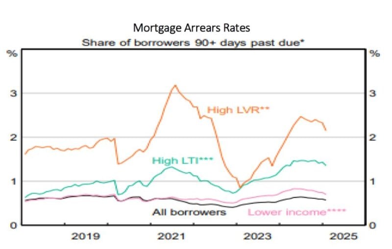
7. Mortgage arrears remain low
Despite concerns about mortgage stress, arrears rates are currently below 1 % and remain low even for borrowers with high loan‑to‑value ratios or high debt‑to‑income ratios. This resilience reflects prudent lending standards, strong employment and sizeable household savings buffers built up during the pandemic. Unless unemployment spikes sharply, a wave of forced sales looks unlikely.
So where are we headed?
Dr Oliver’s base case is for national property prices to gain around 5–6 % over the next year. Falling interest rates and chronic undersupply provide powerful tailwinds, while poor affordability and high debt levels act as constraints. Downside risks include a sharp rise in unemployment or delayed rate cuts, whereas the main upside risk is renewed buyer FOMO if cuts come sooner or are steeper than expected. For investors, strategy matters more than speculation: focus on well‑located, high‑quality assets with solid rental yields and long‑term fundamentals.
This article has been adapted by I‑Think Financial Group from an insight originally published by AMP. The original commentary and charts are the work of Dr Shane Oliver.